
Introduction
The Dashboard feature is designed as a centralised interface that integrates vital information and insights, enabling the effective monitoring, measurement, and analysis of relevant data across key areas to serve as a valuable decision-making tool. The global filters are configured to retrieve data based on the selected Organisation name, Dashboard, and provided filter criteria.
The highlighting features of the Dashboard are:
- Organisation Progress - shows a comprehensive overview of various Operational Indicators and dashboard tiles.
The Operational Indicators serve as vital key performance indicators that are instrumental in evaluating the efficiency and effectiveness of an organisation's operations. This provides insights into key metrics, including New Members, New Clients, Available Members, Unassigned Members, Shift Fill %, Shift Unfill %, Booked Shifts, Booked Shift Hours, and Overtime Hours. The data is shown for selected global date periods, facilitating comparisons of the currently selected Date Periods with the Previous Period and the Previous Year
The dashboard tiles visually represent key metrics, effectively presenting complex information clearly and organised. The presentation allows you to quickly and effortlessly understand essential insights at a glance. The dashboard tiles for People Trends, Business Performance Statistics, Client Acquisition, Shift Demand & Fulfilment, and Shift Fulfilment Trends display data for the globally selected date periods, facilitating comparisons with the corresponding figures from the previous period
🔗For detailed article on the Organisational Progress, click here
- System Consumption - This section helps to gain clarity about your system usage, including all credit-based actions and consumptions. Ideally, leverage this insight to optimise your system usage and identify any excessively high consumption rates
This provides comprehensive insights for Plan Usage Overview, Monthly Usage, Application Total Users, Remaining Credit Balance, Total Database Storage, and File Server Storage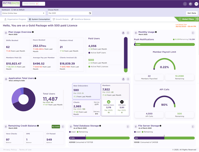
🔗For the detailed article on the System Consumption, click here
- Features - This section displays details of the 'In-use features (Free), 'Available Features (Free)', 'Available Features (Paid) - Contact Us', and 'Active Paid Features (Paid)' of your Entire OnHire system

🔗For detailed article on the Features, click here - Workforce Balance - The Workforce Balance section offers comprehensive insights into the skill-based distribution of the workforce at the State level, categorised by Workforce Overview, Workforce Distribution by States, and Workforce Distribution Across States (Group based)
This section helps organisations to effectively monitor and manage workforce distribution, workload, and efficiency, thereby ensuring optimal staffing to enhance productivity
🔗 For detailed article on the Workforce Balance, click here
How to Access Dashboard?
To access the Dashboard :
- When you login to the Staff Portal, the Dashboard page opens as shown in the figure below

What are Dashboard Components?
The Dashboard Components will help you to get familiarised with the elements used across the dashboard feature. The table below explains the various components used in the dashboard.
| Icons | Description |
| |
Shows the previous date period. |
| |
Shows the previous year period. |
| |
Click to refresh the data. |
|
|
Click to view the full screen. |
|
|
Click to exit the full screen view. |
|
|
Click to collapse the dashboard component. |
|
|
Click to expand the dashboard component. |
|
|
Click to rearrange the placements of any component as needed. |
|
|
The current data shown in green indicates that the data from the Previous Period and the Previous Year meets/ exceeds current data. When the current Date Period, Previous Period, and Previous Year data are in green, the overall dashboard tile will appear in green, indicating positive performance. |
|
|
The current data shown in red color indicates a decline in data for the Previous Period and the Previous Year compared to the current data. When the current Date Period, Previous Period, and Previous Year data are in red, the overall dashboard tile will appear in red, indicating a decline in performance. |
|
|
The current data shown in orange color indicates a variation in performance, representing both a decline, meets/ exceeds or no data for the Previous Period/ Previous Year compared to the current data. When the data for the Previous Period and Previous Year display a combination of red, green, or no color, the current data and overall dashboard tile appear in orange. |
|
|
Upward green arrow indicates an increase in figures compared to the last month |
|
|
Downward red arrow indicates a decrease relative to the last month. |


Related Articles:
Configure Dashboard
Organisation Progress
System Consumption
Features
Workforce Balance